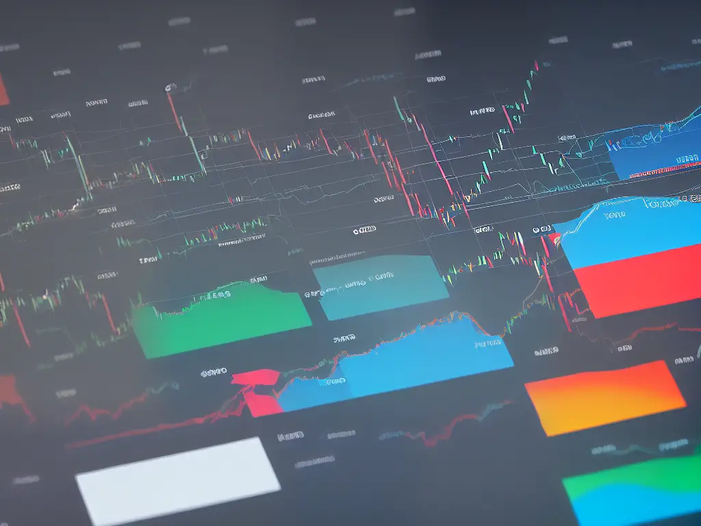
Stock charts are a powerful tool for investors and traders to identify trends, make informed decisions, and maximize profit. Mastering the art of reading stock charts can help you gain valuable insight into the historical and current state of a company’s stock, enabling you to make well-informed decisions about your investments. In this guide, you will learn the fundamentals of stock charts, along with various types, technical indicators, and analysis techniques to enhance your understanding of the stock market and boost your trading success.
Introduction to Stock Charts
Stock charts are visual representations of stocks’ historical performance and are essential tools for traders and investors to analyze the market and make informed decisions. They help identify trends, track price movement, and predict potential outcomes, making it easier to understand complex financial data.
Stock charts provide crucial information for traders and investors, such as the stock’s price history, trend, support and resistance levels, trading volume, and more. By analyzing this data, one can identify potential entry and exit points, minimize risk, and maximize profits based on their market analysis and investment strategy.
Different types of stock charts
There are several types of charts that you can use to analyze a stock’s performance. The most common ones are:
- Line charts: Line charts represent the stock’s closing prices over a specific period by connecting the points with a simple line. This type of chart gives a clear overview of the stock’s general price movement and is suitable for identifying overall trends.
- Bar charts: A bar chart is a more advanced and detailed representation of a stock’s performance. Each bar consists of four components: Open, High, Low, and Close (OHLC) for a given time frame. The top of the bar represents the highest price traded, while the bottom represents the lowest. The opening and closing prices are connected to the high and low by a horizontal line. This type of chart helps traders and investors visualize price ranges and market volatility during a specific period.
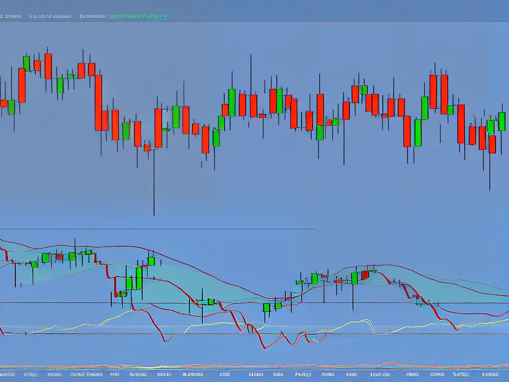
- Candlestick charts: Similar to bar charts, candlestick charts also display the OHLC prices but in a more visually appealing format. It features a rectangle (candle) with upper and lower wicks corresponding to the high and low prices. If the closing price is higher than the opening price, the candle is usually green or white (bullish), and if it’s lower, the candle is red or black (bearish). This type of chart is widely used for identifying and interpreting price patterns and trends.
Stock charts can be displayed in various time frames, such as daily, weekly, monthly, or even intraday (e.g., 1-minute, 5-minute, or hourly charts). The choice of the time frame depends on your trading strategy and objectives. Short-term traders may prefer smaller timeframes like intraday charts, while long-term investors may focus on daily, weekly, or monthly charts.
Essential components of stock charts
Some key components to look out for when reading stock charts include:
- Price: The price axis on the right side of the chart usually shows the stock’s price levels during the selected time frame.
- Volume: The volume bars at the bottom of the chart represents the number of shares traded in a given period. High volume typically indicates strong interest in the stock and increased liquidity.
- Trend: The trend represents the general direction of the stock price over time, either upward (bullish), downward (bearish), or sideways.
- Support and resistance levels: Support levels represent the price at which buying demand is likely to increase, while resistance levels are the price where selling pressure may rise. Identifying these levels can help you establish entry and exit points for your trades.
Popular technical indicators
In addition to the basic components mentioned above, traders and investors use technical indicators to analyze charts. These mathematical calculations help identify patterns, trends, and potential reversals. Some popular technical indicators include:
- Moving Averages (MA): They’re used to identify the average stock price over a given period, smoothing out fluctuations and identifying trends. Commonly used moving averages are simple moving average (SMA) and exponential moving average (EMA).
- Relative Strength Index (RSI): RSI identifies overbought and oversold conditions in the stock, indicating potential reversals.
- Moving Average Convergence Divergence (MACD): This indicator identifies potential shifts in trends by analyzing the relationship between two moving averages.
By understanding the basics of stock charts and their different components, you can begin to analyze and interpret the market more effectively. As you gain experience, you will be able to develop your strategies and make more informed investment decisions. Always remember to apply proper risk management and never invest more than you can afford to lose. Happy trading!
Understanding Chart Types
When it comes to understanding and analyzing the stock market, stock charts play a crucial role. There are different types of stock charts, each with its own advantages and disadvantages. In this guide, we will explore the three most common types of stock charts – line charts, bar charts, and candlestick charts. We will discuss their key features and how to read them effectively.
1. Line Charts
Line charts are the simplest form of stock charts. They consist of a single line that connects the closing prices of a stock or index over a specified period.
- Pros:
- Easy to read and understand
- Provides a clear overview of price trend
- Ideal for beginners
- Cons:
- Limited information (only shows closing prices)
- No details on price movements within each trading session
- How to Read Line Charts:
- Identify the time frame (daily, weekly, monthly, etc.) of the chart
- Find the starting and ending points, which represent the earliest and latest closing prices in the time frame
- The line represents the price movement over this period, with the upward or downward direction representing a rise or fall in the stock price
2. Bar Charts
Bar charts offer more detail than line charts by including the open, high, low, and close (OHLC) prices for each trading session. Each vertical bar represents a single trading session, with the top and bottom of the bar reflecting the highest and lowest prices, and horizontal lines on either side representing the opening and closing prices.
- Pros:
- More information than line charts
- Useful for spotting trends and patterns
- Can help identify support and resistance levels
- Cons:
- Requires more time and effort to interpret
- May appear cluttered or overwhelming for beginners
- How to Read Bar Charts:
- Identify the time frame of the chart
- Each bar represents the open, high, low, and close prices for a particular trading session
- Pay attention to the relationship between the bars – this can reveal information about market sentiment and potential trend reversals
3. Candlestick Charts
Candlestick charts are an advanced form of stock chart that originated in Japan in the 17th century. They display the same information as bar charts but use distinctive “candles” to represent the price movement in a trading session. The body of the candle represents the opening and closing prices, while the “shadows” (thin lines extending from the top and bottom) indicate the high and low prices. Candles can either be “bullish” (green or white) or “bearish” (red or black), depending on the price changes.
- Pros:
- Provides visual representation of price dynamics
- Identifies market sentiment and patterns
- Good for identifying reversals and decision points
- Cons:
- Can be complex for beginners
- Requires more time to analyze compared to line charts
- How to Read Candlestick Charts:
- Understand the basic elements of a candlestick: body, shadows, and color
- Identify the time frame of the chart
- Analyze the relationship between the candlesticks – this reveals information about market sentiment, trends, and potential reversals
- Familiarize yourself with common candlestick patterns (e.g., Doji, Hammer, Hanging Man, Engulfing Pattern, etc.) to identify key decision points and trading opportunities
Understanding and interpreting stock charts is an essential skill for investors and traders alike. By familiarizing yourself with the different chart types and their pros and cons, you will be better equipped to make informed decisions in the stock market. Start with the simplest chart – the line chart – and steadily progress to bar and candlestick charts as you gain more experience and confidence.
Reading Price and Time Axes
Reading stock charts is essential for any adult who wants to understand financial markets, invest in stocks, or simply make well-informed decisions on managing their money. One crucial aspect of reading stock charts is understanding how the price and time axes work. So, let’s begin with a step-by-step guide to reading the price and time axes on a stock chart.
1. Choose a stock chart platform:
The first step is finding a reliable platform or website that provides stock charts. This could be through a trading platform, brokerage account, or free financial websites (such as Yahoo Finance, Google Finance, or TradingView). Choose the one that is easy for you to navigate and understand.
2. Select the stock symbol:
Once you have identified the platform, enter the stock symbol (also known as the ticker symbol) of the company you wish to analyze. This is a unique identifier consisting of letters assigned to a particular stock for trading purposes. For example, the ticker symbol for Apple Inc. is AAPL.
3. Identify the price axis:
After entering the stock symbol, a chart will appear. Here, you will notice two axes – the vertical axis (y-axis) and the horizontal axis (x-axis). The vertical axis on the right (or sometimes left) side of the chart represents the price. The price levels are usually denominated in the currency of the country where the stock is listed, such as dollars for US stocks.
4. Understand the price scale:
The price axis will have labels at regular intervals to indicate the stock prices. These labels help you understand the current stock price and historical prices easily. There are two types of price scales – linear and logarithmic.
- Linear scale: In a linear scale, the equal distance between price levels represents an equal absolute change in the stock price. For example, the distance between $10 and $20 will be the same as the distance between $50 and $60.
- Logarithmic scale: In a logarithmic scale, the equal distance between price levels represents an equal percentage change in the stock price. For example, the distance between $10 and $20 will be the same as the distance between $20 and $40 since both represent a 100% change.
5. Identify the time axis:
The horizontal axis at the bottom of the chart represents time. This can show different time periods such as minutes, hours, days, weeks, or months, depending on the type of chart you are looking at.
6. Set the time frame:
Choose a suitable time frame for your analysis. The time frame you select will depend on your investment horizon (short-term, medium-term, or long-term) and your trading strategy. For instance, long-term investors might prefer daily, weekly, or monthly charts, while short-term traders could use hourly, 15-minute, or 1-minute charts.
7. Understand the time scale:
The time axis will have labeled intervals representing the chosen time frame’s beginning or end. Each label on the time axis represents a specific date and/or time. The number and duration of the labeled intervals vary depending on the chart’s overall time frame.
8. Analyze the stock’s price movement:
With a clear understanding of the price and time axes, you can now analyze the stock’s historical price movement easily. Observe price patterns, trends, and significant price levels. This analysis can help you better understand the stock’s past performance and make informed decisions about its future movement.
Remember, understanding the price and time axes is just the beginning of reading stock charts. To gain a deeper understanding of stock movements, learn about different chart types (such as line, bar, and candlestick charts) and other charting tools like technical indicators, moving averages, and support and resistance levels.
Learning Technical Indicators
Before diving into technical indicators, it’s essential to grasp the fundamentals of stock charts. Stock charts display the price movement of a stock over time, with the x-axis representing time and the y-axis representing the price.
To study technical indicators, you’ll need a charting platform, which is a tool that allows you to analyze stock charts and apply various technical indicators. Some popular platforms include TradingView, MetaTrader, and ThinkorSwim.
Moving averages (MAs) are a popular technical indicator that helps smooth out price data by creating an average of past prices. MAs can help identify trends and trend reversals. The two most common types of MAs are the simple moving average (SMA) and the exponential moving average (EMA).
The Relative Strength Index (RSI) is a momentum oscillator that measures the speed and change of price movements. The RSI ranges between 0 and 100, with readings above 70 considered overbought and readings below 30 considered oversold.
The Moving Average Convergence Divergence (MACD) compares two moving averages, typically a 12-day EMA and a 26-day EMA, to identify bullish or bearish trends.
Bollinger Bands are a volatility indicator that consists of three lines: a simple moving average (typically a 20-day SMA) and two standard deviations above and below the SMA. These bands help identify areas of support and resistance and potential breakouts or reversals.
Now that you have a basic understanding of several popular technical indicators, learn how to combine them to create a more comprehensive trading strategy.
The best way to get a solid grasp of technical indicators is to practice using them on historical price data. Use your chosen charting platform to apply these indicators to various stocks and timeframes, and analyze the outcomes.
Follow financial news, blogs, and forums to gain insights from other traders and to stay informed about new technical indicators and strategies.

Analyzing Chart Patterns
Before diving into specific chart patterns, it’s essential to understand the basic elements of a stock chart. A stock chart typically shows the price movement of a security over time, usually in candlestick, line, or bar format. These charts also display volume and other technical indicators such as moving averages, RSI, and MACD to help you analyze the stock’s performance.
Chart patterns are recognizable formations that occur on stock charts and are used to predict future price movements. Some of the most common chart patterns include:
- Head and Shoulders
- Double Top/Bottom
- Triangles (ascending, descending, and symmetrical)
- Flags and Pennants
- Cup and Handle
- Channels (upward and downward)
The Head and Shoulders pattern is a bearish reversal pattern that consists of three peaks: a higher peak (head) between two lower peaks (shoulders). This pattern implies that the upward trend is coming to an end and a downward trend may begin soon. Look for a break below the neckline (the support level that connects the lows of the two shoulders) as a confirmation of the pattern.
A double top is a bearish reversal pattern that consists of two peaks at approximately the same price level, indicating strong resistance. A double bottom is a bullish reversal pattern with two lows at approximately the same price level, indicating strong support. When the price breaks through the resistance or support level, it confirms the pattern and suggests a trend reversal.
Triangles are continuation patterns that can be ascending, descending, or symmetrical. An ascending triangle consists of a flat resistance line and an upward-sloping support line, suggesting bullish price action. A descending triangle has a flat support line and a downward-sloping resistance line, indicating bearish price action. A symmetrical triangle has converging support and resistance lines, and the breakout direction is uncertain until it occurs.
Flags and Pennants are short-term continuation patterns that occur after a strong price movement and represent a brief consolidation before the trend continues. A flag looks like a small rectangle or a parallelogram sloping against the prevailing trend, while a pennant resembles a small symmetrical triangle. Breakouts in the direction of the prevailing trend confirm the pattern.
The Cup and Handle is a bullish continuation pattern. It consists of a rounded bottom resembling a cup and a small consolidation or downward trend (the handle) that follows. When the price breaks above the resistance level of the handle, it indicates a continuation of the uptrend.
Channels are trend continuation patterns that consist of parallel support and resistance lines. An upward channel indicates a bullish trend, while a downward channel implies a bearish trend. Trade within the channel by buying at the lower support line and selling at the upper resistance line, or trade the breakouts once the price crosses the channel lines.
While chart patterns offer valuable insights into potential future price movements, they are not guaranteed predictors of market behavior. Always use them in conjunction with other technical analysis tools and consider the market’s overall sentiment to make informed trading decisions.
The key to becoming proficient in analyzing chart patterns is practice. Continuously observe and analyze stock charts to familiarize yourself with these patterns and their implications, ultimately helping you make better-informed trading and investment decisions.
Price Volume Analysis
Price Volume Analysis is a method used in the stock market to analyze the relationship between the price movement of a security and its trading volume. This technique can help investors and traders understand the underlying forces that drive price trends, allowing them to make more informed decisions.
-
Choose a stock or security: First, identify the stock that you want to analyze. Make sure to choose a stock with sufficient trading history to ensure you have adequate data for analysis.
-
Select a charting tool: To analyze the price and volume data, you will need a charting tool with the ability to display price and volume information. There are several free and paid charting tools available, such as Yahoo Finance, TradingView, or Thinkorswim.
-
Set the chart parameters: Once you have chosen a charting tool, set the chart parameters depending on your analysis needs. The most common chart types used for Price Volume Analysis are candlestick and bar charts. You can also set the time frame, such as daily, weekly, or monthly, depending on your trading or investing horizon.
-
Plot the price and volume data: With your charting tool configured, plot the price and volume data for the selected stock. Price data is usually represented by candlesticks or bars, while volume data is depicted as vertical bars below the price chart. Make sure the volume bars are distinguishable, as they are crucial for the analysis.
-
Analyze volume changes: Observe the volume bars and compare them to the corresponding price movement. The volume should ideally confirm the price movement, meaning an increase in volume during an uptrend and a decrease in volume during a downtrend.
-
Identify price-volume relationships: Look for specific relationships between price and volume, such as:
- Price and volume increasing together: This is typically a bullish sign, as it indicates that more investors are participating in the uptrend, and the buying pressure is strong.
- Price increasing while volume decreases: This may be a sign of a weakening uptrend, as the reduced volume indicates a lack of interest from buyers, and the trend may reverse.
- Price and volume decreasing together: This is generally a bearish sign since sellers are dominating the market, and the downtrend is likely to continue.
- Price decreasing while volume increases: This could signal a potential reversal of the downtrend, as increased volume may indicate that buyers are more willing to step in and support the price.
-
Look for volume patterns and breakouts: Another key aspect of Price Volume Analysis is identifying volume patterns, such as unusually high or low volume days compared to the stock’s average volume. High volume breakouts often signal a change in sentiment or a significant shift in the market.
-
Use additional technical indicators: Combining Price Volume Analysis with other technical indicators, such as moving averages, support and resistance levels, or RSI, can help validate your findings and provide additional insights.
-
Monitor and adjust: Continuously monitor the stock’s price and volume data to identify any changes or reversals in trends. Adjust your trading or investing strategies based on the findings from your Price Volume Analysis.
Remember that Price Volume Analysis is just one of many methods used to analyze stock trends. It’s essential to incorporate a diverse set of tools and strategies while making trading or investing decisions to minimize risks and maximize potential returns.
Support and Resistance
Support and resistance levels are crucial concepts in understanding stock charts and successfully predicting price reversals. These levels help traders gain insights into the price movements of a stock and make informed decisions on when to enter or exit a trade.
1. Begin with a clear stock chart
First, find a clear stock chart that displays the instrument’s historical price information. Choose a suitable time frame for the chart, depending on your trading style (intraday, daily, weekly, monthly, etc.)
2. Identify support levels
Support levels are prices at which a stock’s downward trend tends to pause and reverse due to increased buying pressure. To identify these levels:
- Look for areas where the price has repeatedly reached a low point before bouncing back upward.
- Draw a horizontal line connecting these low points. This line will act as the support level.
- The more often the price touches the support line, the stronger and more significant the support level is.
3. Identify resistance levels
Resistance levels are prices at which a stock’s upward trend tends to pause or reverse due to increased selling pressure. To identify these levels:
- Look for areas where the price has repeatedly reached a high point before retreating downward.
- Draw a horizontal line connecting these high points. This line will act as the resistance level.
- As with support lines, the more often the price touches the resistance line, the stronger and more significant the resistance level is.
4. Determine the strength of support and resistance levels
When analyzing support and resistance levels, consider the following:
- The more times a level has been tested, the stronger it becomes.
- The longer a support or resistance level remains unbroken, the more significant it becomes.
- The steeper the price trend leading to the support or resistance level, the stronger the level.
5. Use support and resistance levels to predict price reversals
Support and resistance levels can help predict potential price reversals in the following ways:
- If the price approaches a well-defined support level and fails to break through it, this may signal a bullish reversal, indicating it is a good time to buy or go long on the stock.
- If the price approaches a well-defined resistance level and fails to break through it, this may signal a bearish reversal, indicating it is a good time to sell or go short on the stock.
6. Be aware of false breakouts
Sometimes, a price may temporarily move past a support or resistance level, only to reverse course soon after. This is called a false breakout or whipsaw. To filter out these false signals, wait for the price to close above or below the support or resistance level and look for additional confirmation, such as increased trading volume or other technical indicators.
In conclusion, understanding and accurately identifying support and resistance levels on stock charts can significantly enhance your ability to predict potential price reversals. By monitoring these critical levels, you can make informed decisions about when to enter or exit a trade, increasing your chances of success in the stock market.

Trendlines and Moving Averages
To read stock charts effectively, you need access to reliable stock charting software or websites, such as Yahoo Finance, Google Finance, or programs like MetaTrader or TradingView. These platforms will provide various charting tools, including the ability to plot trendlines and moving averages.
Select a stock that you would like to analyze and choose a chart type to display its price history. Candlestick charts and bar charts are popular choices, as they both provide information about price movement within specific timeframes.
A trendline is a straight line that connects at least two significant price points on a chart. It helps identify and visualize the overall trend direction, either upward (bullish) or downward (bearish). Key concepts to understand when using trendlines are:
- Support: A price level where buying interest is strong enough to overcome selling pressure, making it difficult for the price to fall below that level.
- Resistance: A price level where selling interest is strong enough to overcome buying pressure, making it difficult for the price to rise above that level.
To draw a trendline, follow these steps:
- Identify significant price points (usually at price lows for an upward trend and price highs for a downward trend) on the chart.
- Connect at least two of these price points with a straight line. Ideally, the line should touch or come close to multiple points.
- Extend the trendline into the future to help project potential support or resistance levels.
A moving average is a trend-following indicator that smooths out price data by averaging a set number of data points over a specific period. It’s useful for identifying potential trend reversals and support/resistance levels. There are different types of moving averages, but the two most common are:
- Simple Moving Average (SMA): The average price of a security over a specified period (e.g., 20, 50, or 200 days).
- Exponential Moving Average (EMA): A weighted average that gives greater importance to recent price data, making it more responsive to short-term price fluctuations.
Follow these steps to add moving averages to your chart:
- Select a moving average type (either SMA or EMA) from your charting software.
- Choose the time period for the moving average, such as a 50-day SMA or a 14-day EMA.
- Customize the color and thickness of the moving average line, if desired, for better visibility.
- Add the moving average to the chart. It will appear as a continuous line that follows the price movements.
Now that you have trendlines and moving averages on the chart, analyze how they interact with the price data:
- Determine the overall trend direction based on the slope of the trendline and the position of the price relative to the moving average.
- Identify potential support and resistance levels by observing where the price interacts with trendlines and moving averages.
- Look for trend reversals signaled by the price crossing the moving average or breaking through the trendline.
Financial markets are dynamic, and trendlines and moving averages can change over time. Regularly update your analysis to ensure that you are keeping up with current market conditions and adjusting your strategies accordingly.
Remember that no single tool can perfectly predict future price movements. Use trendlines and moving averages in conjunction with other technical indicators and fundamental analysis to build a well-rounded understanding of the stock and its potential performance.
Risk Management and Position Sizing
Understand the importance of risk management: Risk management is a crucial aspect of investing and trading in the stock market. It helps you protect your capital and minimize potential losses. A well-established risk management strategy can help you make more informed decisions and increase the likelihood of achieving your financial goals.
Determine your risk tolerance: Before diving into risk management strategies, it’s essential to understand your risk tolerance. Risk tolerance is the amount of risk you’re willing to take on in your investments. This will vary depending on your financial goals, age, income, and investment experience. Take some time to think about your risk tolerance and ensure that your investment choices align with your comfort level.
Use stop-loss orders: A stop-loss order is an order placed with your broker to sell a stock if it reaches a certain price. This is a crucial component of risk management, as it automatically limits your losses if the stock price drops. Decide on a stop-loss percentage (usually between 1-5%) based on your risk tolerance and apply it consistently across all your investments.
Position sizing: This is the process of determining the number of shares or units to buy based on the risk associated with each trade. A general rule of thumb is not to risk more than 1-2% of your total portfolio value on any single trade. Position sizing can be determined using the following formula:
Position size = (Account size * Risk percentage) / (Stock price – Stop-loss price)
For example, if your account size is $10,000, your risk tolerance is 2%, the stock price is $50, and your stop-loss is set to $45:
Position size = ($10,000 * 0.02) / ($50 – $45) = $200 / $5 = 40 shares
By calculating the position size, you ensure that you’re not risking too much of your capital on a single trade, and you’re maintaining a level of diversification in your portfolio.
Avoid overexposure: Diversification is a key component of risk management. Try not to invest a significant portion of your capital in a single stock or industry. Instead, spread your investments across various industries and asset classes. This helps to minimize the impact of any single stock or industry underperforming.
Continuously review and adjust your risk management strategy: Market conditions and your financial goals can change over time. Periodically review your risk management strategy and make the necessary adjustments. This may include updating your risk tolerance, stop-loss orders, or position sizing.

Practicing Technical Analysis
Choose a stock charting platform:
There are many free online platforms such as Google Finance, Yahoo Finance, and TradingView, where you can access stock charts and perform technical analysis. Some paid platforms such as eSignal and MetaTrader also offer advanced charting tools and features. Choose one that suits your needs and sign up for an account if necessary.
Familiarize yourself with the platform:
Spend some time navigating the platform and understanding where different features and functions are located. Each platform is different, so you should know how to add indicators, draw trendlines, and modify chart settings.
Select the stock and chart type:
Enter the ticker symbol of the stock you’re interested in analyzing, and choose the chart type you’d like to use. Most platforms offer several types, including line, bar, and candlestick charts. Each chart type provides a different way of representing stock data, so choose the one that you’re most comfortable with.
Choose your time frame:
This is an essential step; you need to select a time frame that suits your investing or trading style. Long-term investors might want to analyze data on a weekly or monthly basis, while short-term traders might look at daily or even hourly charts.
Apply technical indicators:
Technical indicators are mathematical calculations based on historical data that can help predict future price movements. Some popular indicators include moving averages, relative strength index (RSI), and Bollinger Bands. Explore different indicators and decide which ones resonate with your analysis approach.
Identify patterns and trends:
Using trendlines and other drawing tools, begin to analyze the stock chart for potential patterns and trends, such as support and resistance levels, breakouts, and reversals. Look for patterns that have a high probability of success based on historical data.
Practice your analysis skills:
Consistently applying your analysis skills and learning from your mistakes is the key to improvement. Keep analyzing different stocks, time frames, and market conditions to gain experience in various scenarios.
Track your performance:
Keep a journal or spreadsheet to log your analysis and trade ideas, as well as the outcomes. Over time you will identify areas where you excel and areas to improve.
Stay updated on news and events:
Market-moving news and events can significantly impact stock prices. Stay informed by reading financial news websites, joining trading forums, and using social media platforms to keep up with market sentiment and news.
Continue learning and refining your strategy:
Technical analysis is an ever-evolving field with new theories and techniques emerging constantly. Keep learning about different strategies, indicators, and tools so you can adapt and refine your approach.
Remember, practice makes perfect. The more you analyze stock charts and apply technical analysis principles, the better you’ll become at making informed trading and investing decisions.
By gaining familiarity and proficiency in reading stock charts, you can better understand the stock market’s movements and make more informed decisions about your investments. Utilize this wealth of knowledge to navigate the complexities of stock trading and identify lucrative opportunities. Continue practicing your skills in technical analysis, applying learned techniques on real stock data, and refining your strategies. With time and experience, your ability to read and interpret stock charts can significantly improve your success in the world of investing and trading.