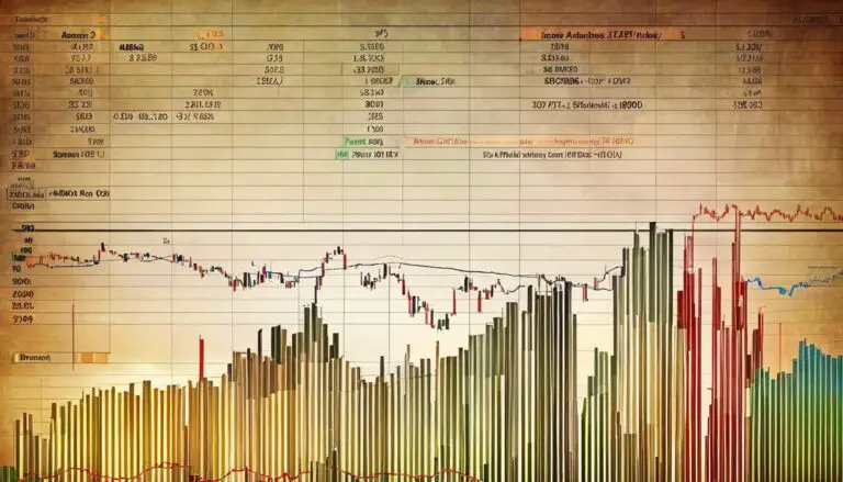
Embarking on the journey of understanding the stock market can often feel like learning a new language, complete with its own set of symbols, patterns, and indicators. One of the fundamental skills for anyone looking to become proficient in this financial domain is the ability to decipher stock market charts. These charts serve as a visual heartbeat of a company’s stock price over time, and grasping what they signify is crucial to making well-informed investment decisions. Whether you’re a novice investor or an avid market watcher, the art of reading these charts is an indispensable tool in your trading arsenal. From the simple line chart that outlines the closing stock prices over a period to the informative candlestick chart revealing detailed price movements, each type of chart paints a unique picture of the market’s past behavior and potential future trends.
Understanding Chart Types
Navigating the Tapestry of Stock Market Charts: Tools for the Astute Investor
In the fast-paced world of high finance, making informed decisions is the bedrock of success. An indispensable tool for any investor is the stock market chart – a visual representation of a stock’s performance over time. These charts are not just pictures; they are the pulse of the market, encapsulating years of data into a single glance. For the savvy entrepreneur looking to carve out a competitive edge, mastering the art of reading these charts is not just a skill, it’s an arsenal.
Let’s dive into the three primary types of stock market charts used by industry mavens to analyze market trends and predict future movements: line charts, bar charts, and the venerable candlestick charts.
Firstly, line charts, the simplest of the trio, plot the closing prices of stock over a set period. These are the go-to charts for a clear and quick insight into the overall trend of a stock’s price. By tracing the line’s trajectory, one can ascertain whether a stock is heading to the moon or descending into the abyss – ideal for the grab-and-go investor seeking a hassle-free temp check on performance.
Moving on, bar charts, also known as OHLC (open, high, low, close) charts, provide a more granular view of the stock’s daily machinations. With notches indicating the opening and closing prices and vertical lines showing the full range of the day’s trading, these charts are a favorite among those who demand more detailed reconnaissance before committing funds to the battlefield of the stock market.
But when it comes to the creme de la creme of data-rich, visually complex mapping, candlestick charts reign supreme. Originating from 18th-century Japan, these charts not only show the opening and closing prices, but their bodies reflect the magnitude of price movement, and shadows indicate the highs and lows. Gaining fluency in reading candlestick patterns is akin to learning the language of the markets, and for those who do, it pays dividends. Candlestick charts are indispensable for the tactician investor who thrives on identifying breakouts, breakdowns, and reversals in stock trends.
In conclusion, whether you’re a seasoned market strategist or a newcomer to the investment arena, understanding how to decipher these charts is pivotal. Line charts offer simplicity and a broad overview, bar charts delve deeper with daily price details, and candlestick charts provide the most comprehensive snapshot of market sentiments and potential trend shifts.
Cut through the noise and peer directly into the market’s soul with these powerful charting tools: your portfolio will thank you for it. Now charge forth, and let the charts guide your way to the zenith of market mastery.

Analyzing Price and Volume
Seizing Opportunities in the Stock Market: Deciphering Price and Volume Signals
Unlock the treasures of the stock market by mastering the subtle language of price movements and trading volumes. The ability to decode the confluence of price and volume on stock charts offers a strategic advantage for detecting market trends.
First, let’s dive into price action. Continual observation of price movements, whether they’re ascending, descending or moving sideways, is foundational for trend analysis. A stock climbing consistently over time is indicative of an uptrend, signaling that the market sentiment is bullish. Conversely, a descending pattern of peaks and troughs signals a downtrend, revealing bearish market perceptions.
Next up, volume – the often-overlooked heartbeat of the market. Volume authenticates price movements; higher volume accompanying a price change substantiates the move. For instance, a price uptick with considerable volume may validate an emerging bullish trend. Similarly, a downtrend with increasing volume warrants attention, confirming sellers’ eagerness to exit.
Drill down further, and one encounters the crucial phenomenon of volume precedents. Often, an uptick in volume may precede a significant price shift. Astute investors watch for spikes or patterns in volume as early warnings for impending price movements.
Analyzing the synergy between price and volume is where the magic happens. Consider the price-volume breakout, where a security leaps or plunges beyond a predefined range on high volume. This convergence often signals continued movement in the direction of the breakout, offering a lucrative entry point for nimble investors.
On the flip side, beware of price-volume divergence. A price rally unaccompanied by corresponding volume increase can indicate waning enthusiasm, potentially preluding a trend reversal. Similarly, a price drop without a surge in volume might suggest the downtrend lacks enough steam to continue.
One final ace up the sleeve is the volume moving average. Overlaying a moving average on the volume indicator smooths out anomalies and provides a clearer perspective on underlying trends. A volume surge well above the moving average underscores significant interest and a potential shift in market dynamics.
Incorporating these price and volume techniques into one’s analytic arsenal can highlight market trends well ahead of the curve, enabling proactive positioning in one’s portfolio. Adopt these strategies, and infuse that investment edge with detailed market insight. Remember, in the universe of stock trading, those who can best forecast the future stand to reap the most substantial rewards.

Identifying Patterns and Trends
When analyzing stock charts for potential market movements, savvy investors home in on pattern recognition to anticipate bullish or bearish outcomes. Mastery of this skill can prove to be a game-changer, and here’s how to identify the most telling patterns.
Head and Shoulders:
Watch for this reversal pattern on both its standard and inverted forms. If the chart exhibits a peak (shoulder), followed by a higher peak (head), and then a lower peak (shoulder), a head and shoulders formation suggests a bearish reversal. Conversely, an inverted head and shoulders indicates a potential bullish swing.
Double Tops and Bottoms:
These patterns signal shifts in momentum. A double top occurs after an extended rise and represents two unsuccessful attempts to break through a price level, forecasting a downturn. In contrast, a double bottom, following a fall, indicates a likely upturn after two failed efforts to push below a price level.
Triangles:
Consolidation patterns like symmetrical, ascending, and descending triangles showcase indecision among investors but point towards impending volatility. A symmetrical triangle suggests a breakout is imminent, with the direction contingent on preceding trends. Ascending triangles usually forecast bullish breakouts, while descending triangles hint at bearish outcomes.
Flags and Pennants:
After a significant price movement, look for these brief, consolidating patterns. Flags resemble rectangles and are formed by parallel trendlines that slope against the preceding trend. Pennants, meanwhile, are small symmetrical triangles that result from price convergence. Both signal continuation if the price breaks out in the direction of the prior trend.
Cup and Handle:
This bullish continuation pattern unfolds over longer periods, where a cup signifies a rounded bottom recovery followed by a handle with a slight downward drift. A breakout from the handle’s resistance leans towards an upward price movement continuation.
Wedges:
Rising and falling wedges can either indicate continuation or reversal. Rising wedges typically form during an uptrend but suggest a bearish reversal as the price contracts. Conversely, falling wedges occur in downtrends but often lead to bullish reversals with price expansion.
Through vigilant attention to these patterns, coupled with solid risk management strategies, investors can position themselves advantageously in response to the stock market’s rhythm. Remember, the confluence of multiple technical indicators alongside patterns strengthens the credibility of predicted movements. Smart investment decisions require a combination of shrewd pattern recognition, rigorous analysis, and the courage to act when opportunity beckons. In the dynamic world of stock trading, let the tape be the ultimate talebearer of fortunes yet to unfold.

Armed with the ability to decode stock market charts, you now have access to a new dimension of financial literacy. Recognizing patterns and trends, and understanding the interplay between price and volume can transform raw data into actionable insights. As you continue to cultivate this skill, remember that each chart tells a story, and becoming fluent in this visual language can empower your investment strategy. May your journey through the nuances of stock market charts sharpen your eye for detail and your foresight into the ebbs and flows of market sentiment, helping you make informed decisions on the road to achieving your financial goals.